
Lansil Global’s rebrand includes a shift into the modern age.
Nine years ago, Lansil Global was founded with a vision to transform the supply chain solutions. Fast forward to today, the company stands at a pivotal juncture, ready to unveil its transformative rebrand. Our journey started with a simple mission: bridge the gap between quality and communication. Today, that mission remains at our core, but we’re taking it a step further.
The world has evolved, and so has Lansil Global. What began as a promising venture nearly a decade ago has now prospered into a global player, offering end to end solutions in China sourcing, manufacturing, freight, warehousing, and global fulfillment.
The rebrand reflects a deep introspection into Lansil Global’s identity and values. It captures the essence of growth to staying at the forefront of industry trends.
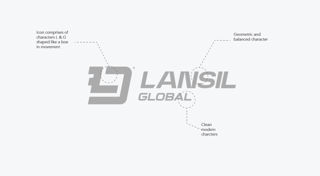
Brand Logo
Our logo is the beating heart of our brand, exuding a bold and unique vibe. The icon comprises characters ‘L’ and ‘G,’ shaped like a box in motion, exhibiting clean and modern design. Overall, the logo is geometric and balanced.
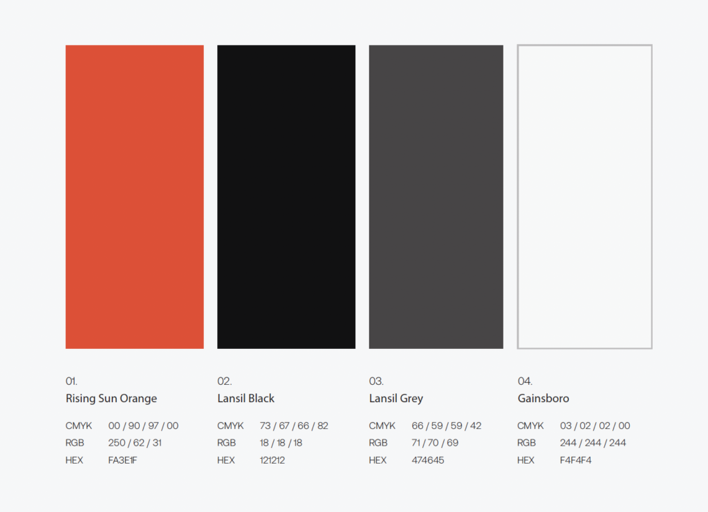
The New Color Palette
Our new palette means business, but we spice it up with a splash of boldness through our standout lead color. We’ve got a Lansil Gray, a deep and striking Lansil Black, and our bold and vibrant Rising Sun Orange in our brand color arsenal.
We Source We Ship
Our tagline says it all: ‘We Source. We Ship.’ Simple, direct, and powerful capturing what Lansil Global stands for in just a few words.
As we introduce our new look, we’re thrilled to have you with us. The updated Lansil Global showcases our determination, new ideas, and a strong promise to do our best. Let’s step into the future together, where big things await. The best is yet to come.